Andrew Danso — f i n d
Cd packaging design
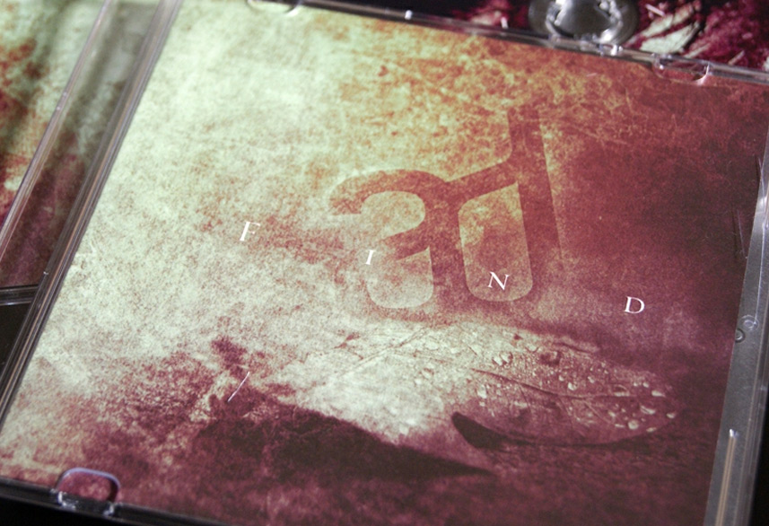
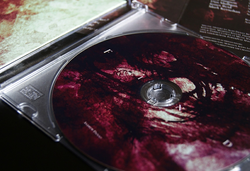
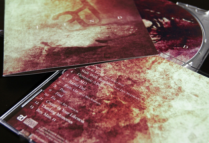
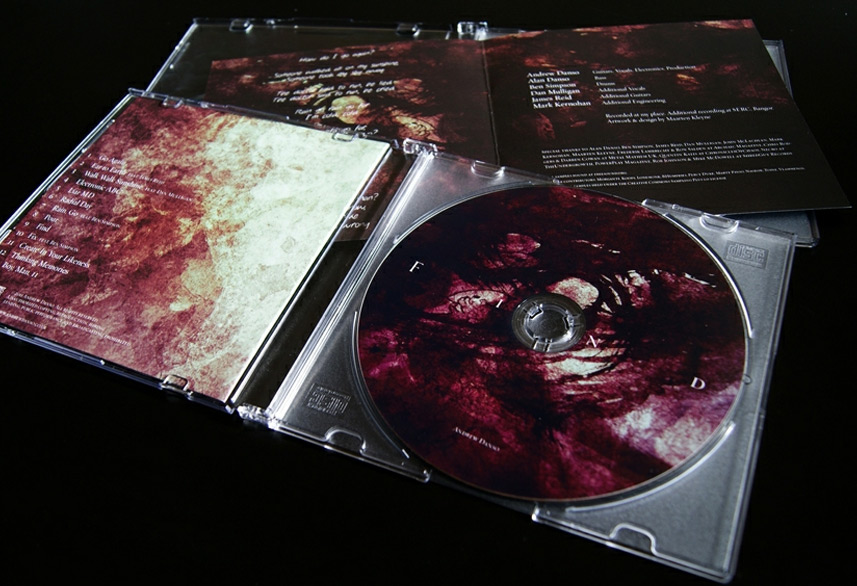

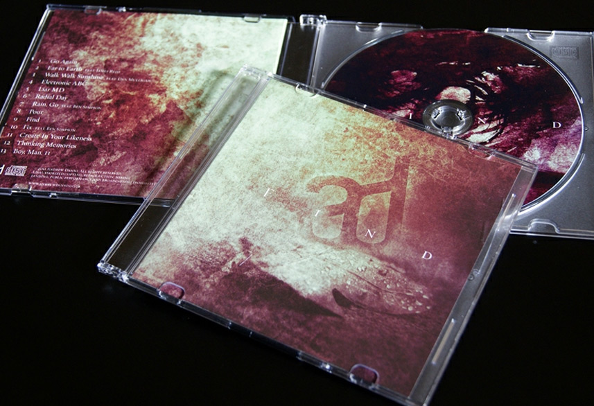
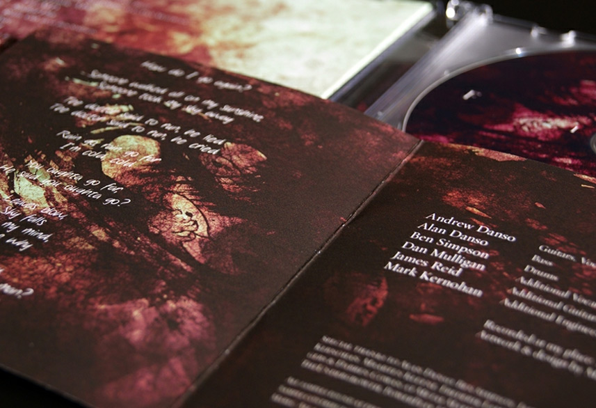
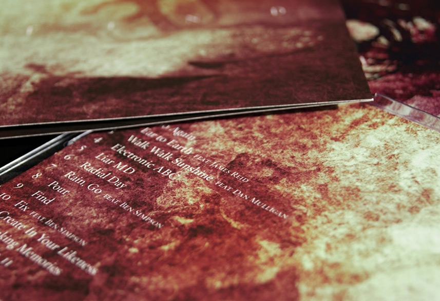
This fantastic project is one with a long story behind it. In a nutshell: Andrew Danso asked me to work on the design of his second album back in February 2010. After a few sketches, concepts, an actual finished design and a year of waiting we decided to revamp the entire thing in February this year (2011). The result of that decision is the album artwork you now see before you. I’m excited to finally share the record design I made for Andrew’s album titled: f i n d.
As Andrew puts it:
The album itself is an airy look at where he’s been with music for the past few years and feeling the urge for change. That last part is also one of the things that caused the project to evolve into something different as it progressed. A fairly neurotic piece, ‘f i n d’ is his most spaced, progressive project. It should float with you up and beyond, with a few rocks in between.
For the artwork I decided to approach a natural feeling and underline that spaced and progressive feeling with an overall minimalistic vibe. I created the logotype of Andrew’s initials and shaped it like a solid rock coming from the ground. During the project Andrew acclaimed a strong affection for macro imagery and the concept behind that, which we related to the cd design. You can see most of those hints in the front and back covers. The album contains something of a two-part journey which I reflected in the interior and exterior covers and their specific alternative coloring.
So why revamp the original album design?
Well, to answer that I wrote an in-depth article about it. Quite fast after the release of this portfolio-item I was commissioned to write an extensive case study and tutorial, for which I chose to use this artwork as topic. Interested in seeing how and why I created this artwork the way that I did? Read my case study about it on the GoMediaZine.
Need a unique cd packaging design for your (band’s) new record, EP or single? Get in touch today → and let’s see if I can be of service to you.
